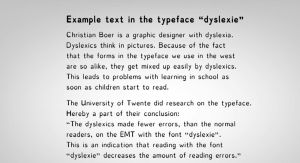
Here are samples of the two most common fonts aimed specifically at dyslexia


They certainly attract a lot of attention in the press and on social media.
I know they are trying to be helpful but I don’t like them or find them helpful.
As a dyslexic person I find myself reacting very negatively to them not just because they are portrayed as a panacea but because they are not to my taste. They are very clunky and unattractive.
On a (screen) tablet,pc or phone I have a preference for well spaced highly legible text on a just off white background as I find that the glare from pure white slows me down.
Other people will have other preferences. This is important.
Allow people to chose – don’t assume that what works for one will work for another.
This study would appear to show that they are not as effective as they claim.
Click to access assets2013.pdf
Here is a link to Adrian Roselli’s write up from CSUN on research findings presented there.
The article below is a good balanced read from a typography point of view.
http://www.commarts.com/Columns.aspx?pub=6950&pageid=1785
It’s commonly accepted amongst the UK dyslexia community that sans serif fonts are preferable on a screen see the British Dyslexia Association pages:
http://bdatech.org/what-technology/typefaces-for-dyslexia/
However layout contrast and font size are at least as important if not more so than the font choice. Configurability and personal preference are therefore key.
Signage fonts generally are designed with legibility and intelligibility in mind and there has been a lot of research into creating good ones. They have to work for people who’s brains are already under significant cognitive load from driving.
The award winning gov.uk uses a signage font “New Transport”
And a personal favourite of mine (including the research) wayfinding sans
http://ilovetypography.com/2012/04/19/the-design-of-a-signage-typeface/

This article was originally published at atrophiedmind


